
Digitising Wound Care for Elderly Patients
Digitising Wound Care for Elderly Patients
Digitising Wound Care for Elderly Patients
Digitising Wound Care for Elderly Patients
Digitising Wound Care for Elderly Patients
Transforming paper-based workflows into an intuitive digital solution that helps clinicians provide better care for elderly patients with chronic ulcer wounds.
Transforming paper-based workflows into an intuitive digital solution that helps clinicians provide better care for elderly patients with chronic ulcer wounds.
Overview
Led the end-to-end UX for a tablet-based platform that replaced paper workflows for elderly clinicians treating diabetic wounds. Designed a non-linear, accessible UI that reduced treatment time from 1.5 hours to under 15 minutes, with user research, testing, and stakeholder alignment driving design decisions.
My responsibilities
• Led UX strategy and execution from research through delivery
• Conducted remote user research with elderly clinicians to identify pain points
• Built and tested interactive prototypes for iterative validation
• Created an accessible, scalable design system tailored to medical use
• Partnered closely with PMs and developers to ensure design fidelity in build
Team:
• Product Manager
• Business Analyst
• Developers
• CTO
Team:
• Product Manager
• Business Analyst
• Developers
• CTO
Team:
• Product Manager
• Business Analyst
• Developers
• CTO
Team:
• Product Manager
• Business Analyst
• Developers
• CTO
Timeline:
9 months
Team:
• Product Manager
• Business Analyst
• Developers
• CTO
Team:
• Product Manager
• Business Analyst
• Developers
• CTO
Team:
• Product Manager
• Business Analyst
• Developers
• CTO
My role:
Lead UX Designer
My role:
Lead UX Designer
My role:
Lead UX Designer
My role:
Lead UX Designer
Problems
Elderly patients with chronic ulcer wounds require consistent monitoring and documentation. Healthcare providers were relying on paper-based systems that led to:
• Inconsistent documentation across care teams
• Difficulty tracking wound healing progress
• Time-consuming manual processes
• Risk of lost or illegible records
The Goal
Design a digital solution that would streamline wound care documentation while being intuitive enough for healthcare providers of all technical skill levels.
• Accuracy for documentation
• Decrease treatment time from 1.5 hrs to 15 mins
• Bring convenience to patients by bringing clinicians to patient's homes
Design a digital solution that would streamline wound care documentation while being intuitive enough for healthcare providers of all technical skill levels.
• Accuracy for treatment and documentation
• Bring down the treatment time from 1.5 hrs to 15 mins
• Bring convenience to patients by bringing clinicians to patient's homes

Wireframes used to initial understanding of Clinician-Patient encounter.
Clinicians concerns—research observations
• Accuracy
They are concerned about getting the assessment and treatment done correctly.
• Goal oriented
They are okay with compromises on ‘design’ as long as their job is done.
• Non-linear workflow
The steps in assessement and treatment procedures vary based on case to case basis
• Time conscious
They want to save time and cover more patients in a day.
• Not tech savvy
Shortcomings of elder Clinicians working on digital interfaces needed extra care
Research insight
The clinicians were highly skilled, many—especially those around 55 yrs and older—feared that unfamiliar technology could disrupt their efficiency and undermine their expertise.
The MVP
We developed a treatment procedure that is flexible to use by clinicians in any order that they prefer depending on the conditions of the patient. This encapsulated the accessibility features for helping elderly Clinicians (main user demographic) which were introduced after repeated testing and product discovery.
We developed a treatment procedure that is flexible to use by clinicians in any order that they prefer depending on the conditions of the patient. This encapsulated the accessibility features for helping elderly Clinicians (main user demographic) which were introduced after repeated testing and product discovery.

Opportunity 1 - Assessment & treatment flow
How might we enable clinicians to pick treatment procedures in the order that the clinicians want at any time?
How might we enable clinicians to pick treatment procedures in the unique order that the clinicians want at any time?
Addressing opportunity 1 with navigation
Assessment workflow is the most important workflow in the application. The documentation of the wound for a patient happens here and the success of the platform depends on how fast a Clinician can cover the documentation and treatment.

Floating action button for linear workflow


Tab for non-linear workflow

The primary job for me as designer was to present the information that Clinicians might need frictionlessly, hide the information that's not needed and devise a way for faster interactions to capture wound info. As Clinicians are free to go any path to document and treat the wound or follow a linear path to completion, I had to curate a workflow that tailors to both their requirements efficiently.
Opportunity 2 - The digital transformation
How might we make the transition from paper based patient encounter to digital medium as smooth as possible for Clinicians?
How might we make the data digestible enabling an overview of companies but also see the details?
Addressing opportunity 2 with accessibility
When designing for the elderly, every interaction had the potential to make or break the solution. This shaped the design decisions and the design system.
Checboxes with outline
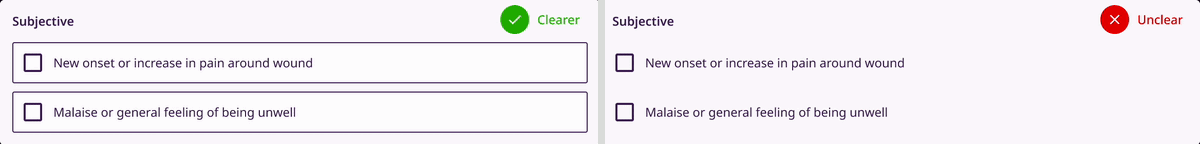
Clinicians would read the options and return to the checkbox to select the option (right). I recommended checkboxes with outlines (left) for faster selection.
Radio buttons with outline
Similar approach with outline was taken for radio buttons with the outlines. The shape was made rounder without any icon for easier and faster differentiation from a checkbox.
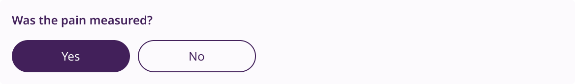
Large buttons

The buttons were made larger so that Clinicians can tap on the button during treatment procedure without difficulty.
Interactive components with similar colour

Consistent colour usage across interactive elements enhances recognition and supports faster recall for efficient task completion so button, checkboxes and radio buttons were made from same colour family.
I emphasised on making the controls evident to be noticed and positioning them where Clinicians expect them to be. The size of the CTAs are large and shown with the contextual vocabulary which were expected. CTAs were designed in the same colour family to make clear association with interactions.
The use of colours on text whether on buttons or on page were given extra care to meet contrast ratios standards for accessibility (WCAG AA) and (WCAG AAA)
Colour contrast between text, background and accent colours

The colour contrast had to pass AAA accessibility guidelines therefore the contrast between text, background and accent colour were carefully picked.
Larger font size

Larger font size were picked for faster reading and type scaling factor a higher number.
Using text familiar to the Clinicians in succinct sentences. Keeping large font-size heading that could bind the contents below and maintaining space between sections to signify the start and the end. Choosing larger font-sizes for increased legibility for the user demographics.
Using these techniques, I achieved clean and focus enabling user-interfaces.
Usability testing
Testing 1


Learnings:
• Mirroring physical behaviour digitally didn’t work
• Where a clinician is navigating to is unclear
• Flipping through pages wastes time
Testing 2


Learnings:
• Animating pages up and down led to disorientation
• Clinicians struggled to know which form they were at
Testing 3


Learnings:
• Visibility to access to other forms worked
• Interaction with interactive components
could be faster
Testing 4
4th testing met the criteria of treatment documentation completion in under 15 mins.


Learnings:
• Visibility to access to other forms worked
• Interaction with interactive components
could be faster
Speeding up other flows


• 4x faster wound identification
• Sped up overall documentaion process
• Increased more focused treatment

A dashboard where clinicians can track the progress of the patients and their wounds.
We had successfully made a minimum viable product that was ready for the market. Through consistent design evangelism and design delivery, I was able to get both stakeholders and client onboard for having a design-led approach to the project.
You can read more about the design approach on a Medium blog post here.
Outcomes
• Assessment workflow completion met the target of 15 mins
• Convinced stakeholders research oriented design process
• Delivered end to end product within 9 months
• 92% of the clinicians prefer new method to the old method
• Saw a boost in number of patients treated in day by 59% eight months later
• Adoption of the new method by new clinicians is the new norm
• Brought down screen time use of the clinicians by 83%
Next steps (if I cont'd)
• Test assessment workflow with edge cases
• Working on inventory workflows
• Navigation of the clinicians to the patient’s home can be stressful
and needs better preparation
• Role of the app in cases where a patient is critical
• Test assessment workflow with edge cases
• Working on inventory workflows
• Navigation of the clinicians to the patient’s home can be stressful
and needs better preparation
• Role of the app in cases where a patient is critical
More Projects
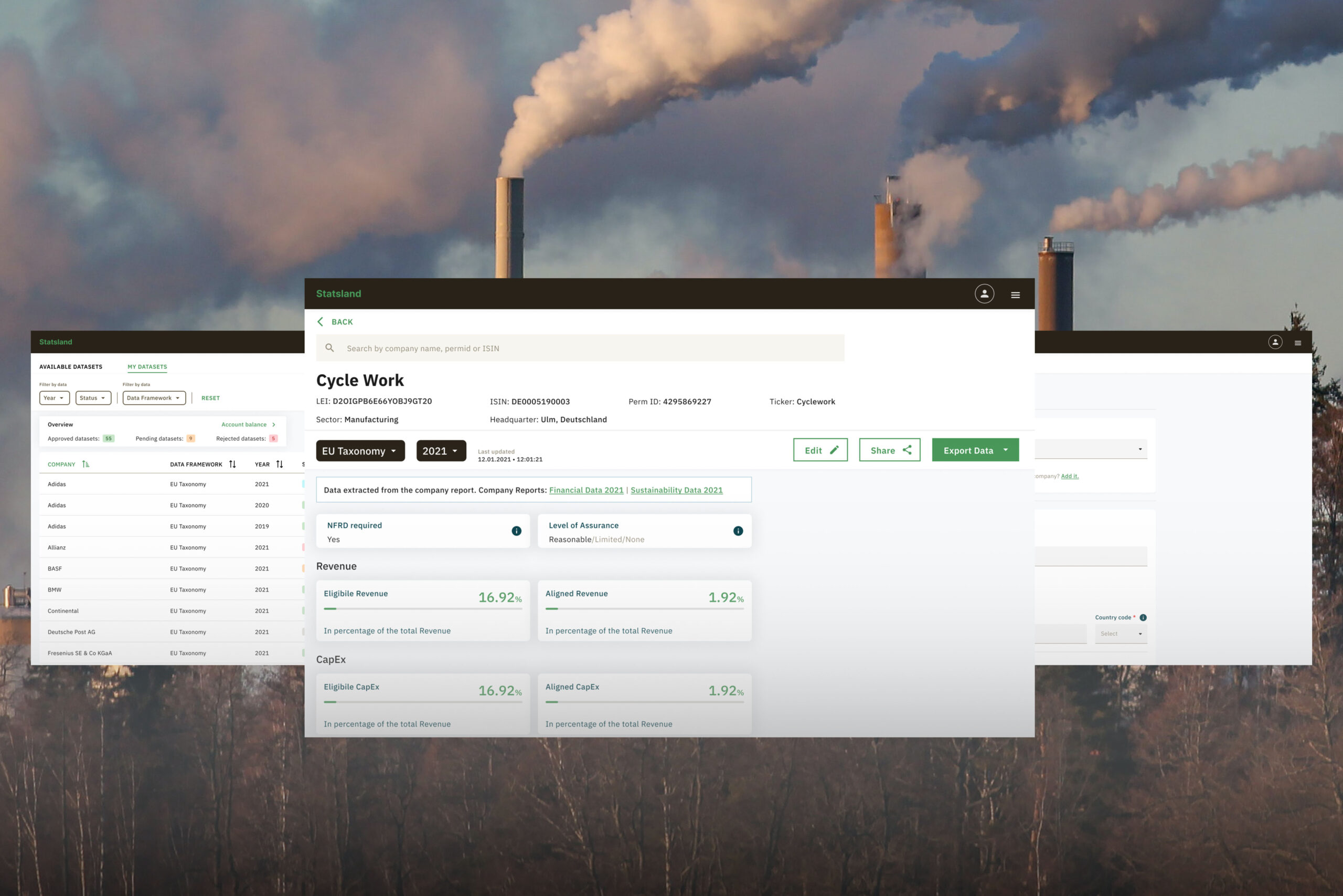
StatslandLaunched sustainability (ESG) data platform from 0 to 1 for data analysts. #B2B #sustainability
SimpleDesigned onboarding experience of healthcare workers informed by research insights. #healthcare #mobileapp
Video FacilitatorRe-designed the platform to support online workshops for large scale conferences using research methods. #B2C #workhops
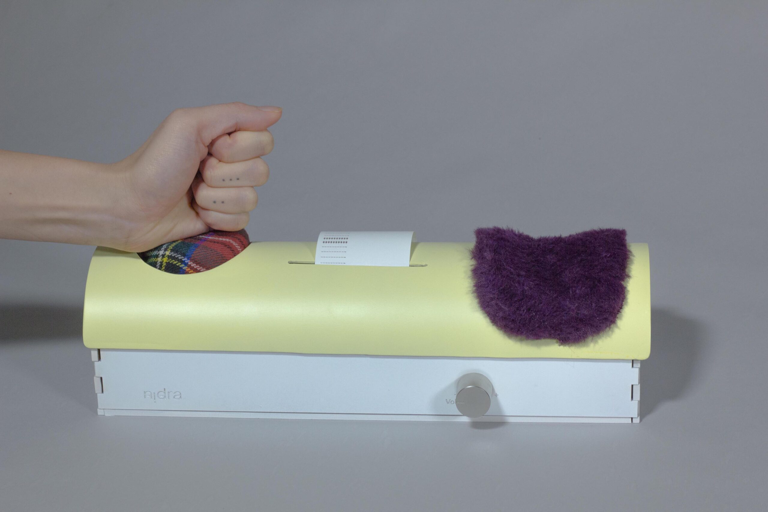
NidraExperimental tool to provide relief to sleep deprived people. #collegeproject #sleep #experimental