
Digitising Wound Care for Elderly Patients
Digitising Wound Care for Elderly Patients
Digitising Wound Care for Elderly Patients
Digitising Wound Care for Elderly Patients
Digitising Wound Care for Elderly Patients
Reframing the goal from a faster form to clinician trust, then redesigning the workflow around elderly-user constraints, cut assessments from 1.5 hours to 14 minutes
Reframing the goal from a faster form to clinician trust, then redesigning the workflow around elderly-user constraints, cut assessments from 1.5 hours to 14 minutes.
TL;DR
A MedTech company needed to move elderly clinicians from paper-based wound assessments to a digital tablet workflow without slowing them down. I led UX/visual/interaction design end-to-end. First usability round failed the target badly (avg. ~35 min vs. a 15-min goal); after redesigning the assessment workflow and controls around elderly-user constraints, the final round hit 17 of 22 clinicians at ~14 minutes, down from a 1.5 hour paper process.
Team:
• Product Manager
• Business Analyst
• Developers
• CTO
Team:
• Product Manager
• Business Analyst
• Developers
• CTO
Team:
• Product Manager
• Business Analyst
• Developers
• CTO
Team:
• Product Manager
• Business Analyst
• Developers
• CTO
Timeline:
9 months
Team:
• Product Manager
• Business Analyst
• Developers
• CTO
Team:
• Product Manager
• Business Analyst
• Developers
• CTO
Team:
• Product Manager
• Business Analyst
• Developers
• CTO
My role:
Lead Product Designer
My role:
Lead UX Designer
My role:
Lead Product Designer
My role:
Lead Product Designer
Outcomes
• Assessment workflow completion met the target of 15 mins
• Convinced stakeholders research oriented design process
• Delivered end to end product within 9 months
• 92% of the clinicians prefer new method to the old method
• Saw a boost in number of patients treated in day by 59% eight months later
• Adoption of the new method by new clinicians is the new norm
• Assessment workflow completion met the target of 15 mins
• Convinced stakeholders research oriented design process
• Delivered end to end product within 9 months
• 92% of the clinicians prefer new method to the old method
• Saw a boost in number of patients treated in day by 59% eight months later
• Adoption of the new method by new clinicians is the new norm
• Brought down screen time use of the clinicians by 83%
The MVP
We developed a treatment procedure that is flexible to use by clinicians in any order that they prefer depending on the conditions of the patient. This encapsulated the accessibility features for helping elderly Clinicians (main user demographic) which were introduced after repeated testing and product discovery.
We developed a treatment procedure that is flexible to use by clinicians in any order that they prefer depending on the conditions of the patient. This encapsulated the accessibility features for helping elderly Clinicians (main user demographic) which were introduced after repeated testing and product discovery.

Clinicians concerns: research observations
Everyone assumed the goal was a faster form. It was actually about building trust with clinicians who feared technology would slow them down or make them look incompetent. Once that reframe happened, the workflow design followed.
• Accuracy
They are concerned about getting the assessment and treatment done correctly.
• Goal oriented
They are okay with compromises on ‘design’ as long as their job is done.
• Non-linear workflow
The steps in assessement and treatment procedures vary based on case to case basis
• Time conscious
They want to save time and cover more patients in a day.
• Not tech savvy
Shortcomings of elder Clinicians working on digital interfaces needed extra care
Research insight
The clinicians were highly skilled, many especially those around 55 yrs and older feared that unfamiliar technology could disrupt their efficiency and undermine their expertise.

Wireframes used to initial understanding of Clinician-Patient encounter.
Other design decisions
When designing for the elderly, every interaction had the potential to make or break the solution. This shaped the design decisions and the design system.
Tab for non-linear workflow

Floating action button for linear workflow

Checboxes with outline

Clinicians would read the options and return to the checkbox to select the option (right). I recommended checkboxes with outlines (left) for faster selection.
Large buttons

The buttons were made larger so that Clinicians can tap on the button during treatment procedure without difficulty.
Radio buttons with outline

Similar approach with outline was taken for radio buttons with the outlines. The shape was made rounder without any icon for easier and faster differentiation from a checkbox.
High contrast colours

The colour contrast had to pass AAA accessibility guidelines therefore the contrast between text, background and accent colour were carefully picked.
Similar colour interactive components

Consistent colour usage across interactive elements enhances recognition and supports faster recall for efficient task completion so button, checkboxes and radio buttons were made from same colour family.
Large font scaling sizes
Large font scaling sizes

Larger font size were picked for faster reading and type scaling factor a higher number.
Usability testing
Testing 1


Learnings:
• Mirroring physical behaviour digitally didn’t work
• Where a clinician is navigating to is unclear
• Flipping through pages wastes time
Testing 2


Learnings:
• Animating pages up and down led to disorientation
• Clinicians struggled to know which form they were at
Testing 3


Learnings:
• Visibility to access to other forms worked
• Interaction with interactive components
could be faster
Testing 4
4th testing met the criteria of treatment documentation completion in under 15 mins.


Learnings:
• Navigating to different forms was quick
• This iteration enabled linear or arbitrary order for selecting a form
Wound indentification in a card

• 4x faster wound identification
• Sped up overall documentaion process
• Increased more focused treatment
You can read more about the design approach on a Medium blog post here.
Next steps (if I cont'd)
• Test assessment workflow with edge cases
• Working on inventory workflows
• Navigation of the clinicians to the patient’s home can be stressful
and needs better preparation
• Role of the app in cases where a patient is critical
• Test assessment workflow with edge cases
• Working on inventory workflows
• Navigation of the clinicians to the patient’s home can be stressful
and needs better preparation
• Role of the app in cases where a patient is critical
More Projects
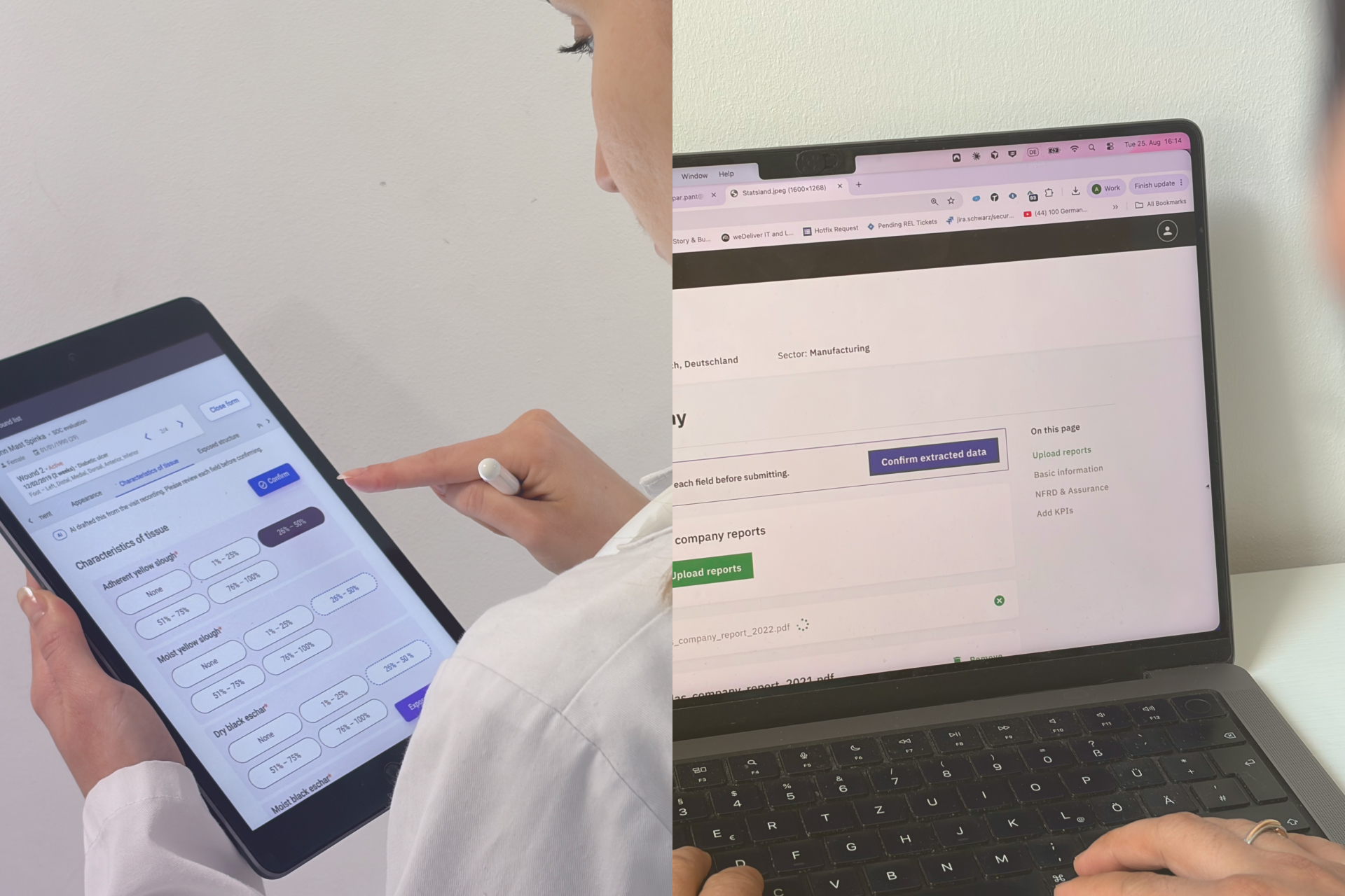
Designing Trust into AIAgentic flows | B2B
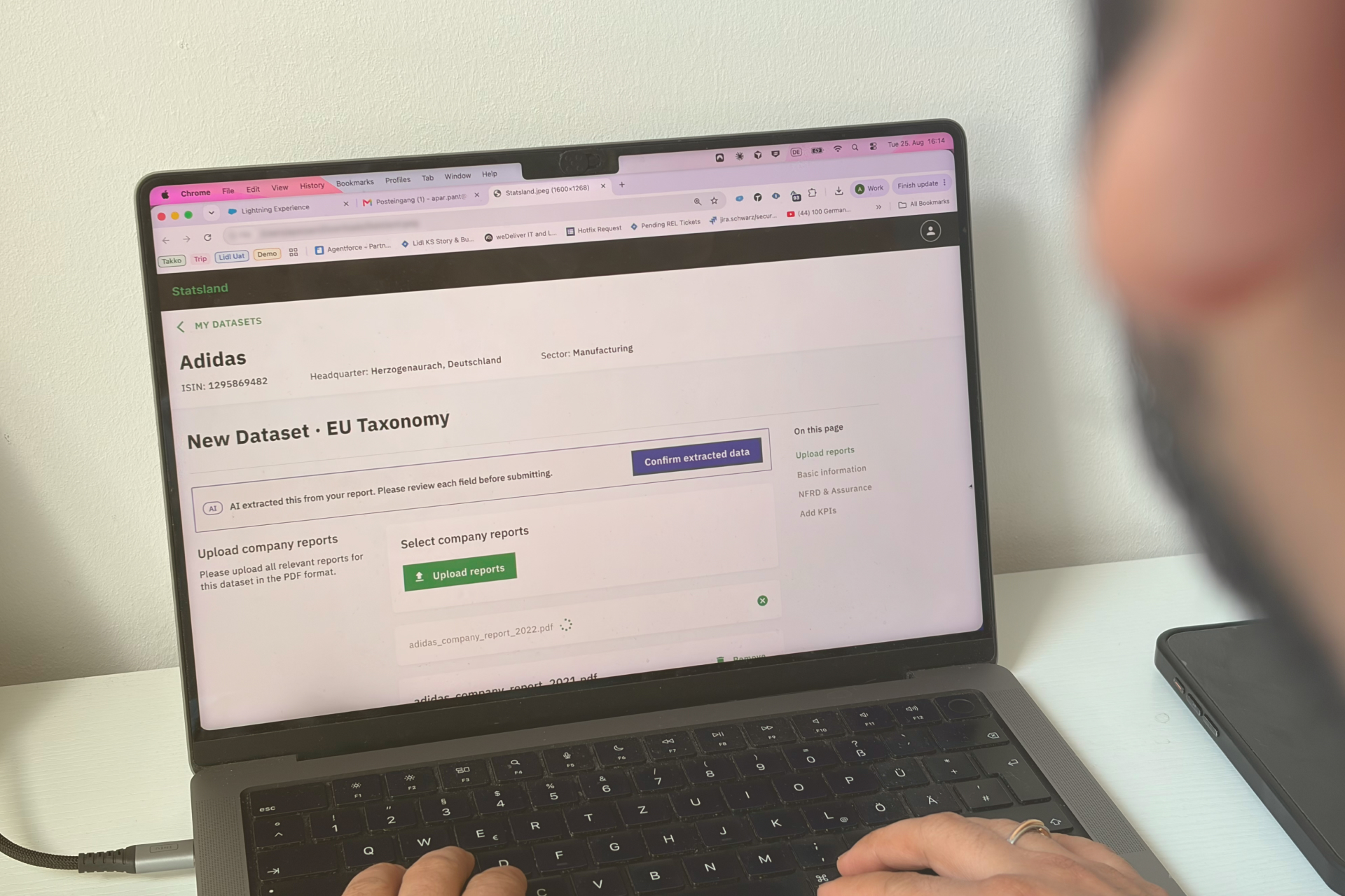
StatslandLaunched sustainability (ESG) data platform from 0 to 1 for data analysts. #B2B #sustainability
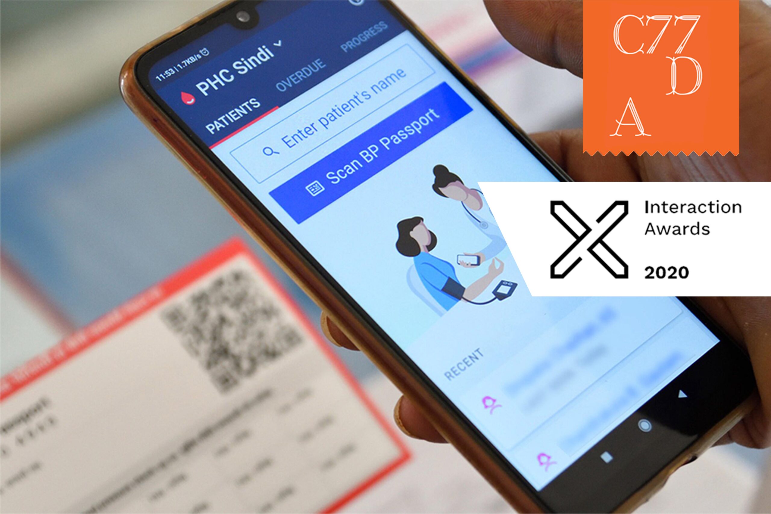
SimpleDesigned onboarding experience of healthcare workers informed by research insights. #healthcare #mobileapp