
Challenge
Create a platform to track hypertension of patients to increase the control rate.
Outcome
An android app, a web-based application and a printed card called BP Passport.
Try the demo app here.
Tags
#systemdesign
#healthcare
#mobileapp
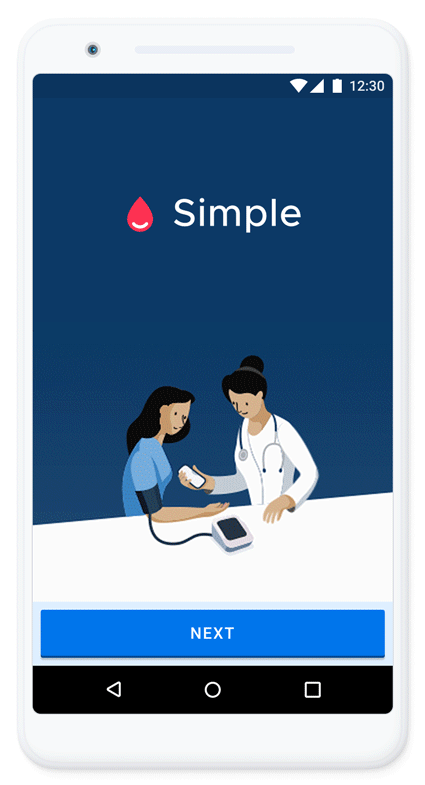
Simple
Simple
Imagine joining a social-impact project where the product is literally saving lives. The project didn’t need me, I needed the project.
The project, Simple aims to reduce the number of people dying from heart disease and strokes in low and middle-income countries and is supported by Resolve to Save Lives, an initiative of the not-for-profit Vital Strategies.
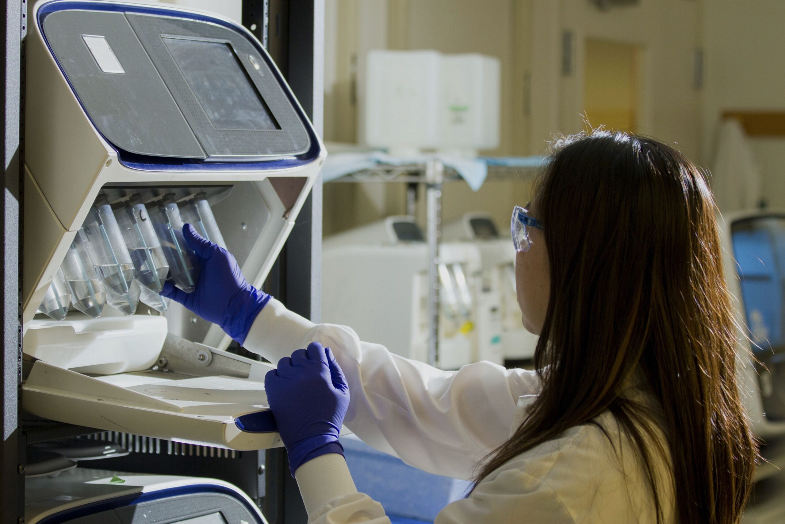
Nurses and clinicians play an active role to ensure patients receive regular check-ups, but in a large country like India, a typical nurse sees around a hundred patients a day. Facilities don’t have a standardised patient flow and tracking individual patient is very difficult.
High blood pressure (BP) is ranked as the third most important risk factor for the attributable burden of disease in South Asia (2010). Hypertension (HTN) exerts a substantial public health burden on cardiovascular health status and healthcare systems in India. HTN is directly responsible for 57% of all stroke deaths and 24% of all coronary heart disease (CHD) deaths in India. The WHO rates HTN as one of the most important causes of premature death worldwide.
The challeneges
The challeneges
The challeneges
Be able to fit into existing & extremely busy workflows
Easy to learn and use, even for first time smartphone users
Offline first
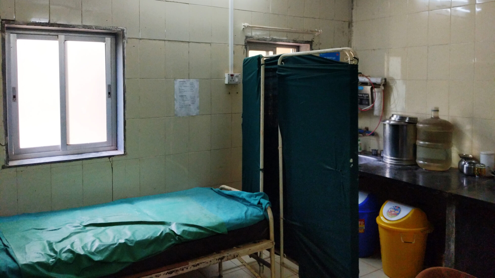
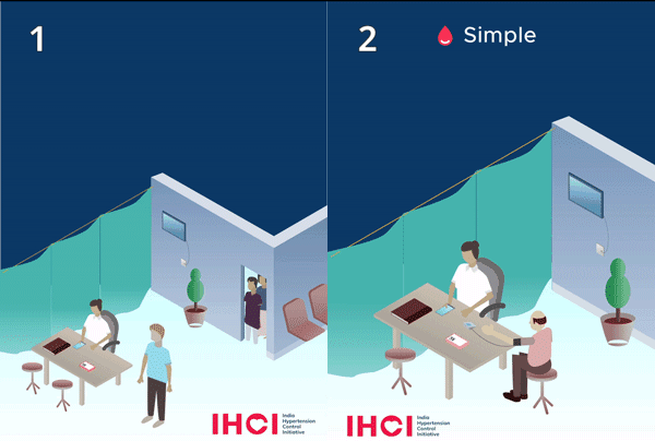
A rural health facility room.
A rural health facility room.
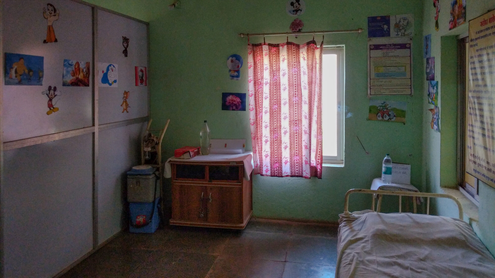
Children's ward.
Children's ward.
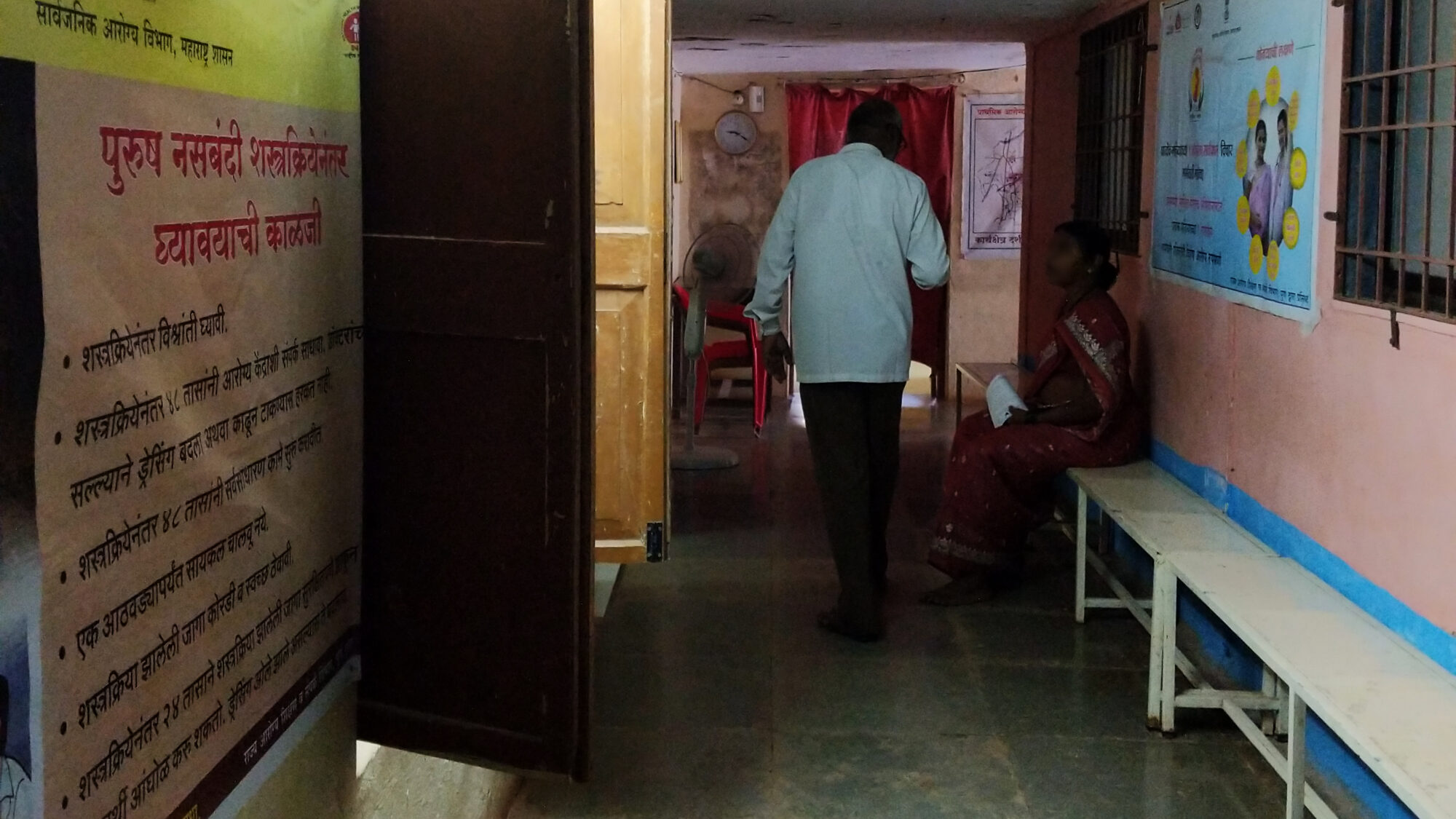
Govt's health campaign posters are put up in the waiting area.
Govt's health campaign posters are put up in the waiting area.
To better understand the context we were dealing with we interviewed nearly 200 doctors and nurses and worked with them to develop concepts through iterative prototyping and testing. To fit ourselves into their shoes we simulated a clinic at our office to chart out scenarios and relevant artefacts and created a clinic experience by creating role-plays.
Simple is a mobile app that enables healthcare workers to track blood pressure levels of hypertensive patients, maintain their medication and schedule their subsequent visits by presenting the information in a time-effective manner to improve the hypertension control rate.
A web-based dashboard helps health system managers collect feedback from their facilities to make decisions to improve hypertension control rate.
I’ve worked as a product designer on this project for six months and have got the opportunity to visit the field for user testing and work on some workflows of the app that are shown below.
Onboarding
——
The design philosophy behind Simple is to keep the product as simple as possible to prevent its users from the need for prerequisite smartphone experience. Keeping that in mind, the on-boarding screen must communicate the product’s intent in a few seconds.
When I came on this project, my first work was the onboarding journey. From the outside, it looks the most basic thing to do, only to realise that onboarding journey should encapsulate the founding pillars of the product ‘Simplicity’.
The healthcare professionals were given workshops to use the app where the onboarding used to happen. With Simple reaching multiple locations within Indian states, Bangladesh and Ethiopia, conducting onboarding workshops for nurses were putting burden on cost and time. And without the onboarding workshop, the onboarding appeared abrupt.
The healthcare professionals were given workshops to use the app where the onboarding used to happen. With Simple reaching multiple locations within Indian states, Bangladesh and Ethiopia, conducting onboarding workshops for nurses were putting burden on cost and time. And without the onboarding workshop, the onboarding appeared abrupt.
Animation showing smooth transfer of measurements.
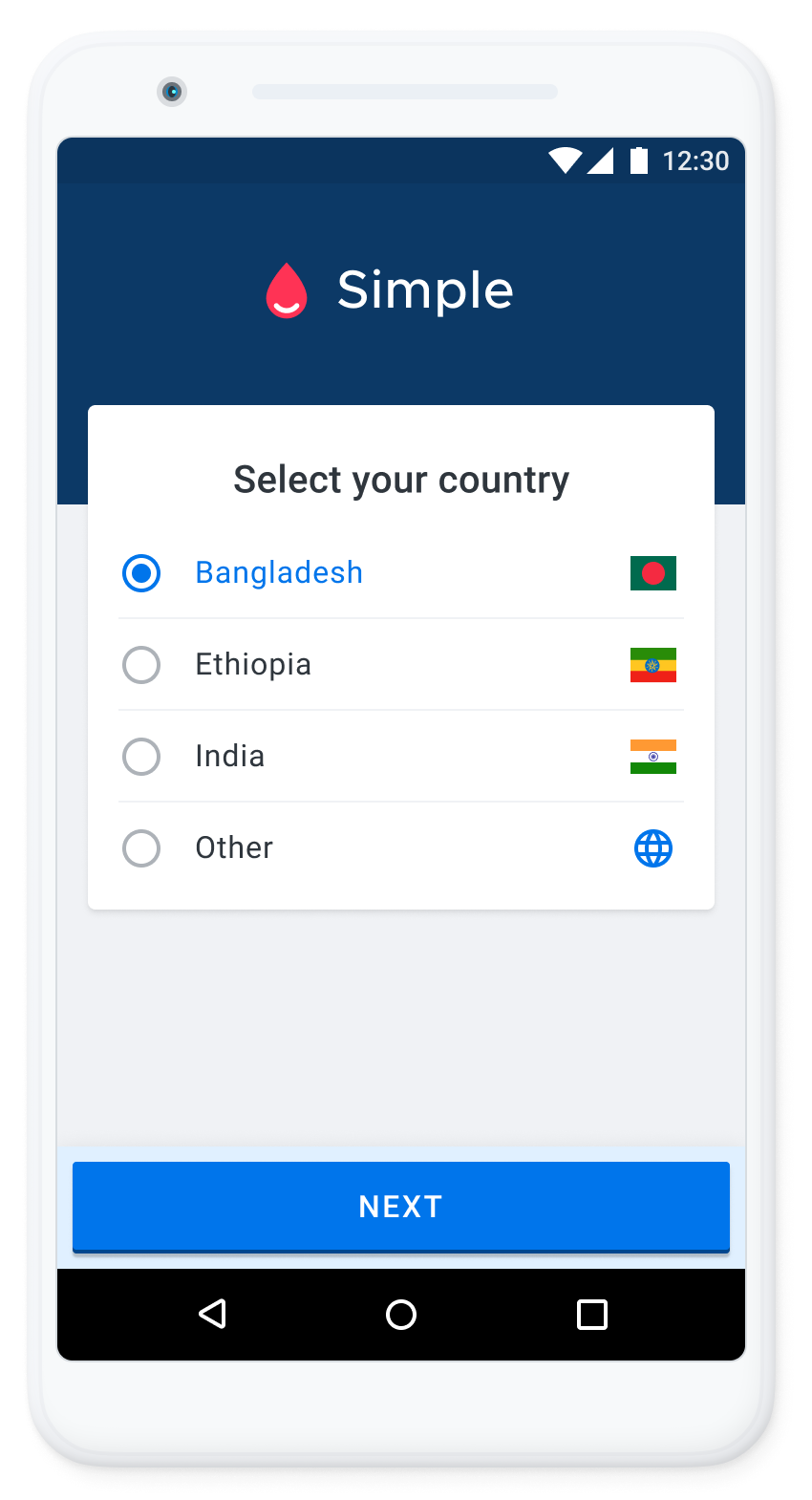
Country selection.
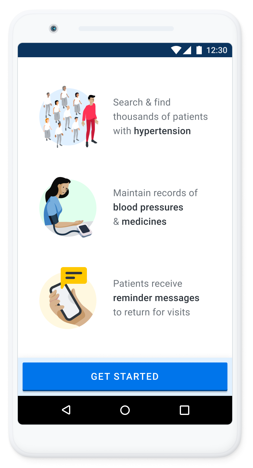
The key functions of the app are demonstrated.

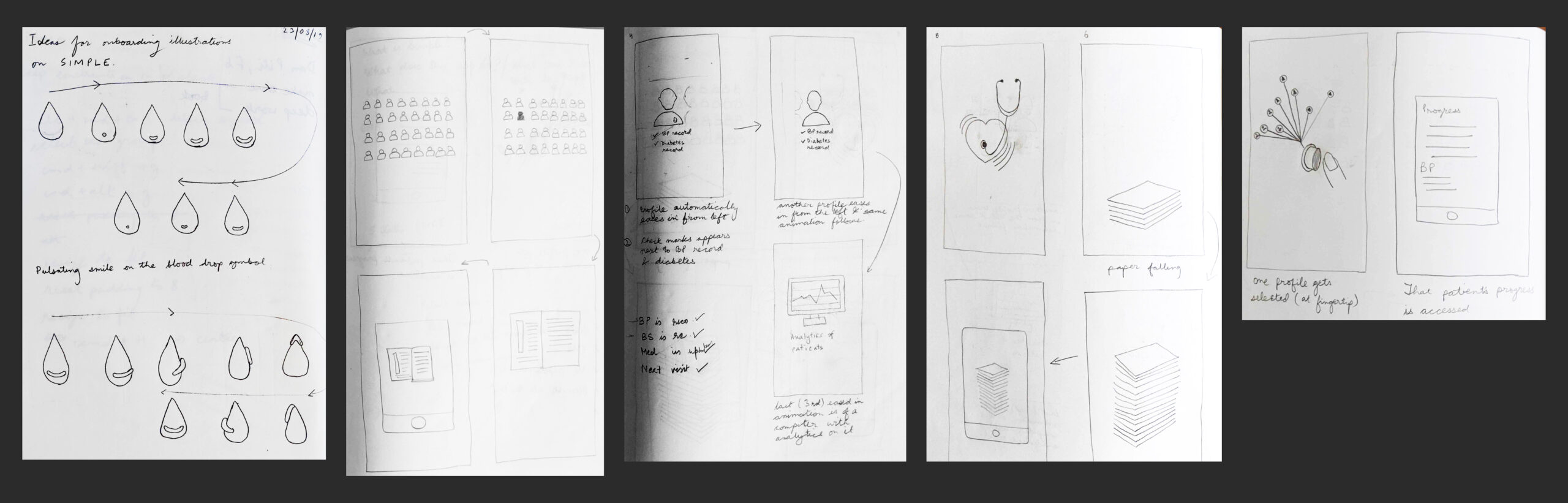
Mind mapping exercise to understand what 'Simple' represents (above). Paper sketches showing explorations for onboarding journey (below).
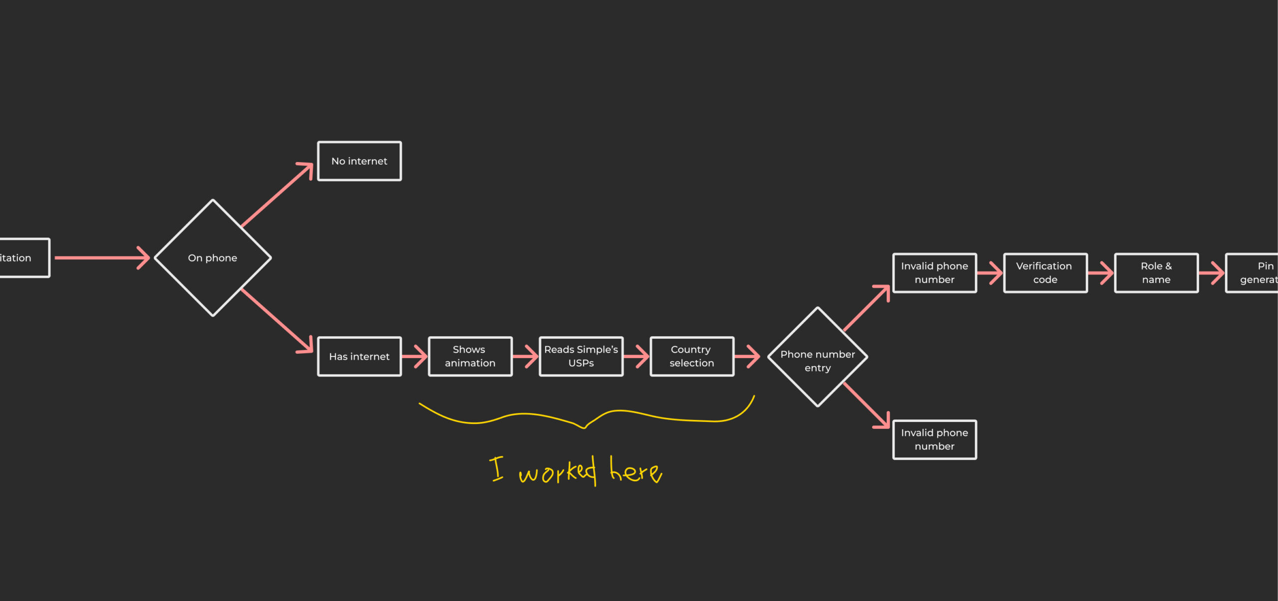
User flow for onboarding journey.
Starting with paper exploration and moving to digital concepts, I landed up with ’Simple’ and self explanatory solution. The animation had to be worked on using with Lottie for implementation purpose. A simple onboarding experience allowing the selection of the country, the main functions of Simple and the animation explaining how quickly the BP reading is entered into the app.
Two explorations for onboarding experience which showcase patients journey.
Medicine Selection
——
Product thinking is critical to bringing ease of use to a user. While working on help for Simple, meticulous care was given on how the user can a user be helped in a state of panic, the contents that are important and how can they be best presented.
On the screen, an affordance next to medicine's strength makes it very clear that nurses can change the strength upon pressing it. Without the affordance earlier, nurses feared that pressing on strength would uncheck the medicine.
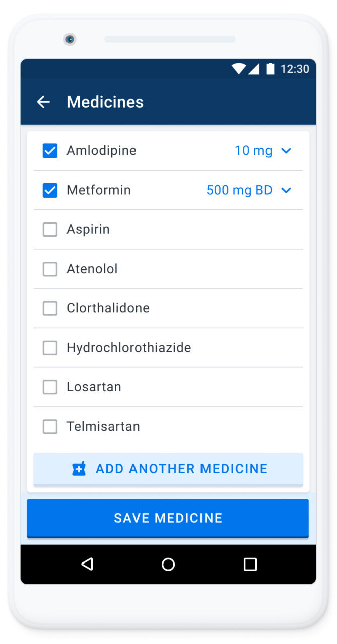
Medicine selection screens from the app.
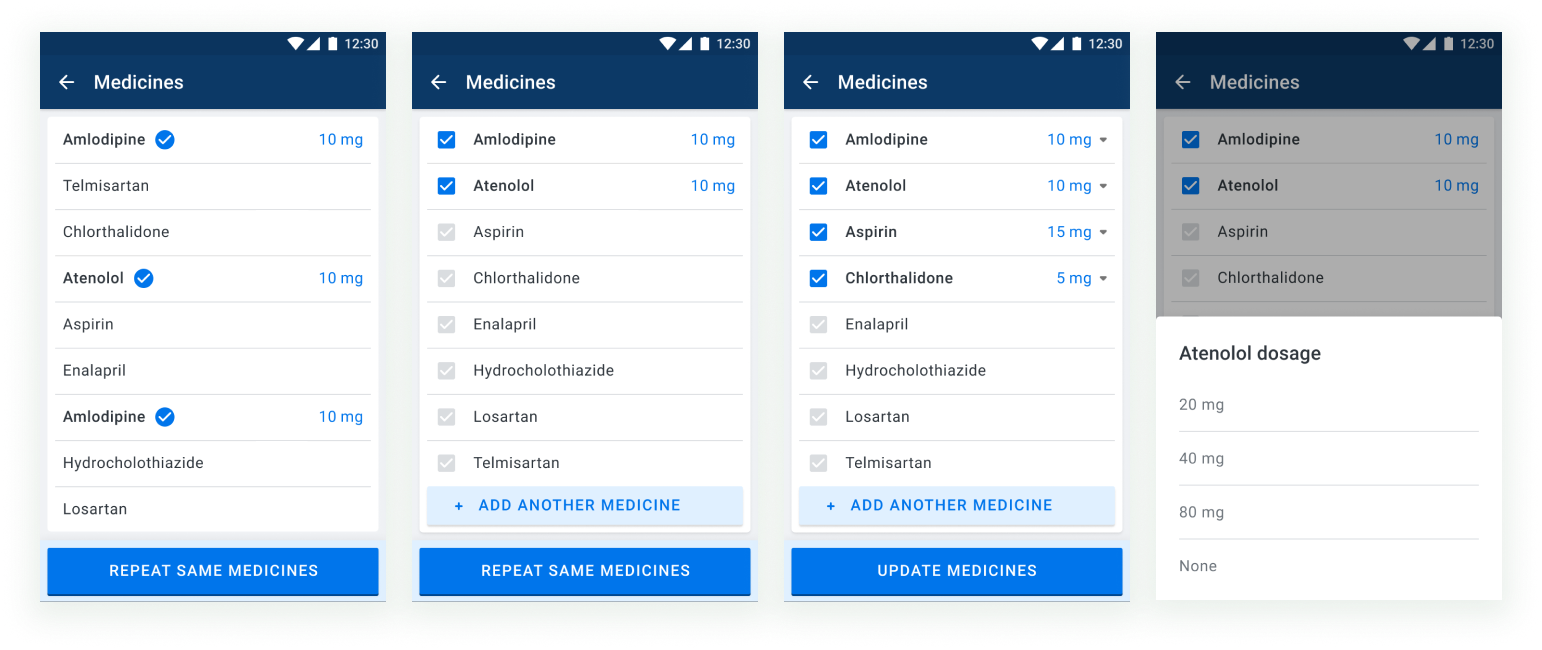
Design iterations for selecting medicine dosages. A dropdown icon next to the dosage indicates that the user can select the dosage without unselecting the medicine.
BP Trend
——
Exploration was an important part of Simple app and we learnt that healthcare workers would like to see the trajectory ‘trend’ of the patient’s health in one glance. On the right, are some of the low fidelity explorations done to understand the information that needs to be presented and its placement. Below is how they were presented on the interface.
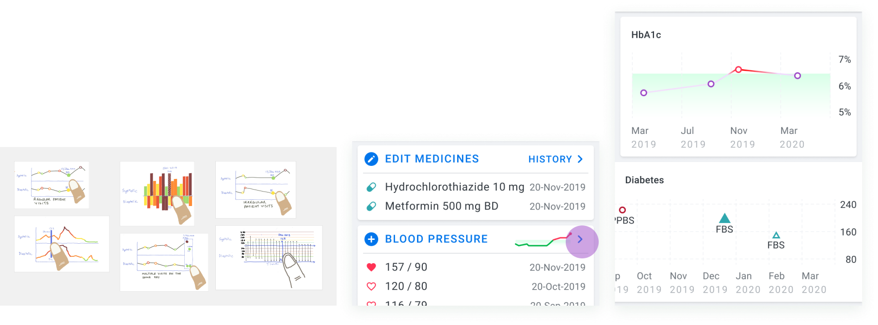
Low fidelity to understand the information that needs to be displayed (left) and how they can be incorporated in the interface (centre & right).
Progress Tab
——
Nurses want to be informed about how their facility is doing in managing the patients and what areas they need to improve upon. This can be tracked by Progress Tab on the app. The design team ideated on some ideas and I took the responsibility to flesh them out. We performed card sorting exercise with the users to learn what they find relevant and prioritised the cards accordingly. You can also read up about the field exercise.
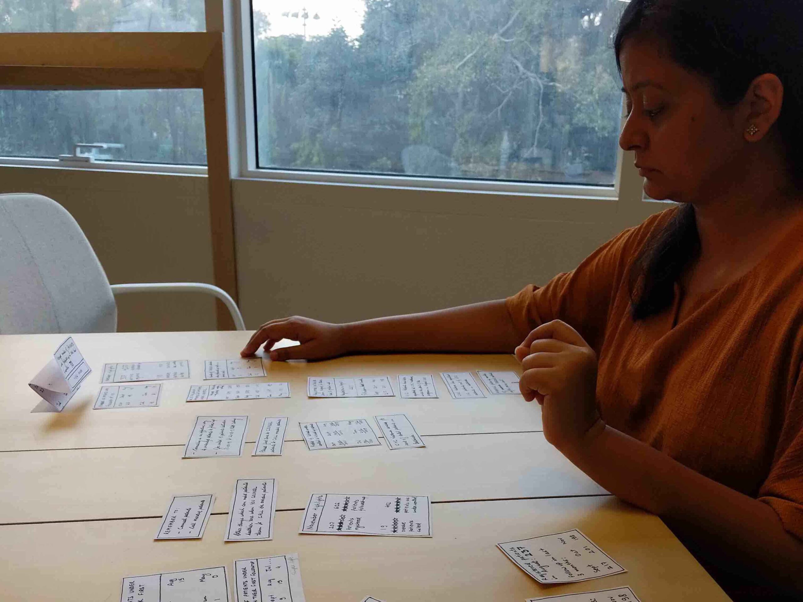
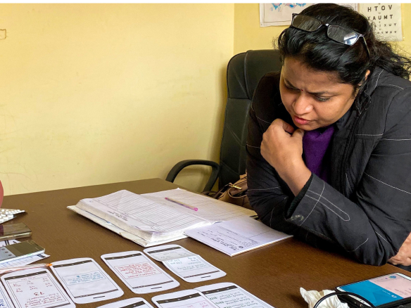
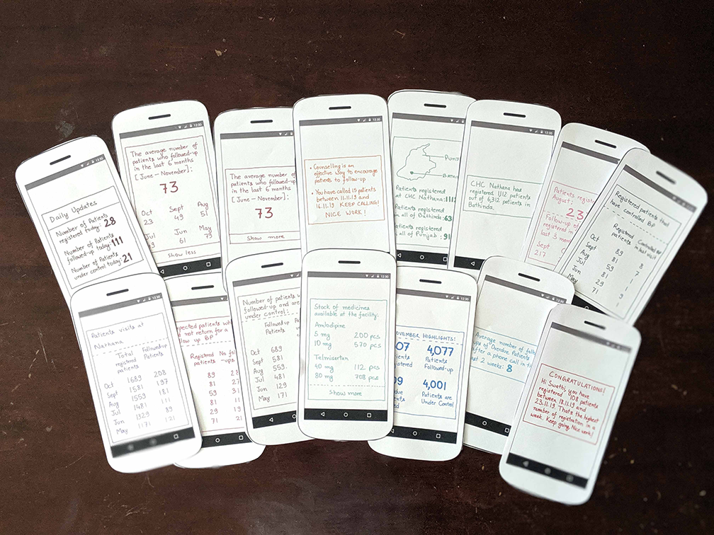
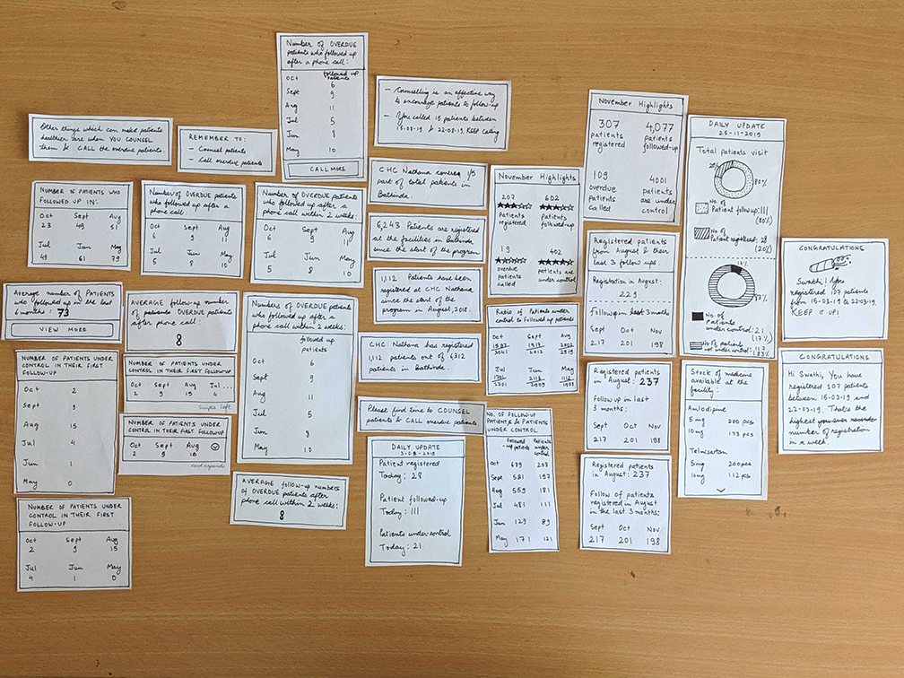
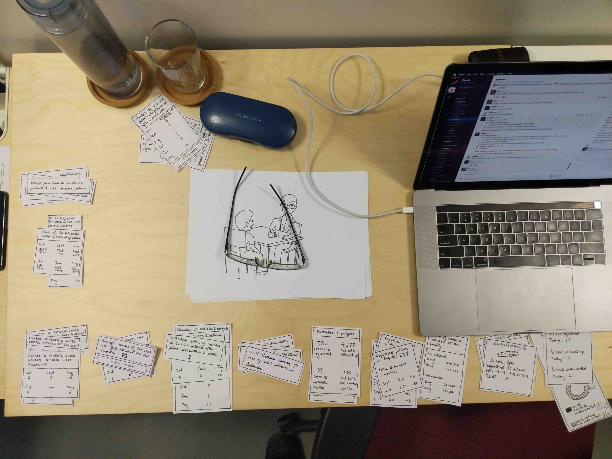
I worked on multiple iterations for developing the content for the cards. The final ones were taken to the field for card sorting and co-creation.
I worked on multiple iterations for developing the content for the cards.
The final ones were taken to the field for card sorting and co-creation.
5,235 active* public health facilities | 4,679,231 patients | 31,027,546 BPs recorded | 13 sec follow-up | 83 sec registration
* Data updated 1-Apr-2024
The project continues to grow and also launched in Bangladesh and Ethiopia. Simple is an open-source project and you can learn more on the design front and read our blog. You can download the demo version of the app here.
Awards: IxDA 2020 Best in the show,
Core77 Runner Up (Design for Social Impact),
Index Award Finalist
The project continues to grow and will soon launch in Bangladesh and Ethiopia.
Simple is an open-source project and you can learn more on the design front and read our blog.
Awards: IxDA 2020 Best in the show,
Core77 Runner Up (Design for Social Impact),
Index Award Finalist
The project continues to grow and will soon launch in Bangladesh and Ethiopia.
Simple is an open-source project and you can learn more on the design front and read our blog.
Awards: IxDA 2020 Best in the show,
Core77 Runner Up,
Index Award Finalist
More Projects
StatslandLaunched an environmental, social, and governance (ESG) data platform from paper to market.
ZonderHelped clinicians reduce wound treatment time from 2 hrs to 15 mins.
Video FacilitatorRe-designed the platform to support facilitation for large scale conferences.
Connected Health PlatformProvided clarity to stakeholders through prototyping.
NidraExperimental tool to provide relief to sleep deprived people.