Challenge
Ulcer wounds of patients are documented, treated and medicated using paper and pen that easily take 1.5 hours to complete. Our challenege was to enable Clincians complete the entire process in 15 minutes so that they can cover more patients.
Challenge
The project aims to highlight one of the most important but underrated activities of human body; sleep. The most affected people are the ones who work in emergency services. Sleep is integral to such professionals as its an important driver for productivity on the job. The challenge was make a design solution which is physical and can evoke a visceral response.
Outcome
A web-based platform for Clinicians tailored for tablets for convenience and mobility.
Live version cannot be shared.
Outcome
A web-based platform for Clinicians tailored for tablets for convenience and mobility.
Live version cannot be shared.
Responsibilities
Client engagement
Concept development
UI design system creation
Prototyping
Research
Context
Patients with diabetes develop ulcer wounds in their body. This happens due to poor blood circulation and leads to prolonged healing process for the wounds. Prior to the project, the process to administer treatment and medication was paper based—making the patient’s journey and retrival time for the records, longer.
Patients with diabetes usually generate ulcer wounds in their body. This happens due to poor blood circulation and leads to prolonged healing process for the ulcer wounds. Prior to the project, the process to administer treatment and medication was paper based—making the patient’s journey and retrival time for the records, longer.
Problems to address
For the clinicians, it was to quicken the documentation of a patient’s wound.
For the patients, it was to be able to receive Clinician’s consultation and medication at their home.
Approach to the problems
Design approach
Being a designer, I had to balance out the inputs from the stakeholders from business standpoint while maintaining a good understanding of the clinicians who were going to use the application. Therefore I created sacrificial prototypes to gain understanding and move forwards.
Zonder is a web application that enables Clinicians to document, administer treatment, prescribe tests and medication to patients with Ulcer wounds in a time effective manner at patient’s home.
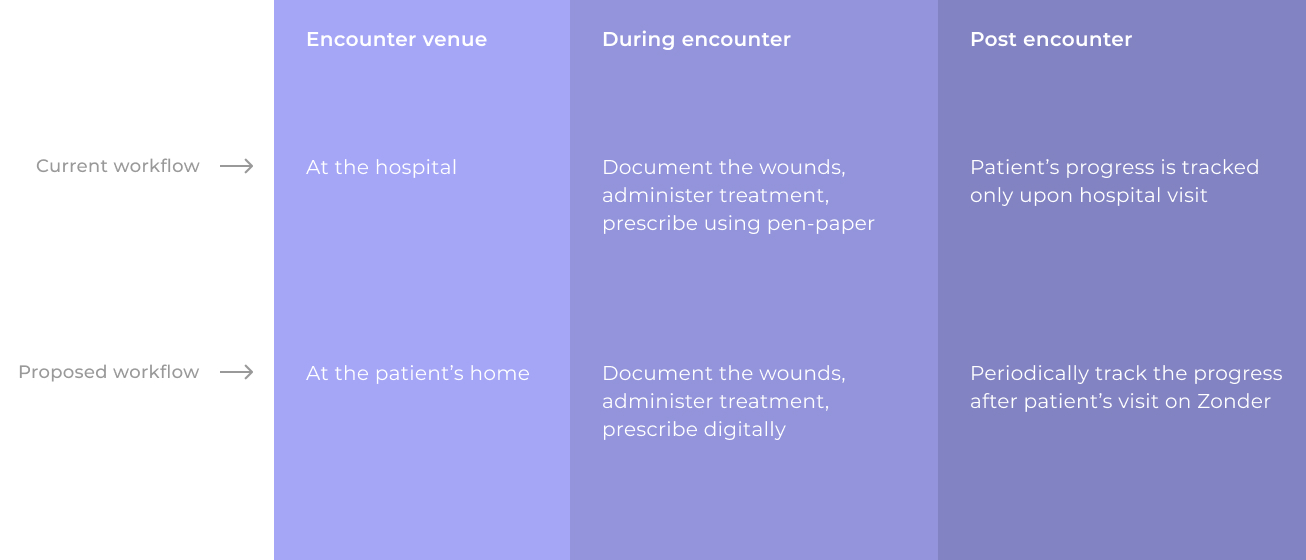
Traditionally the treatment was administered at the hospital but the Zonder was disrupting the treatment procedure by bringing the treatment to the home of the patients.
Success metric:
Patient Clinicians encounter time is brought down from 1.5 hrs to 15 mins.
Zonder
Zonder
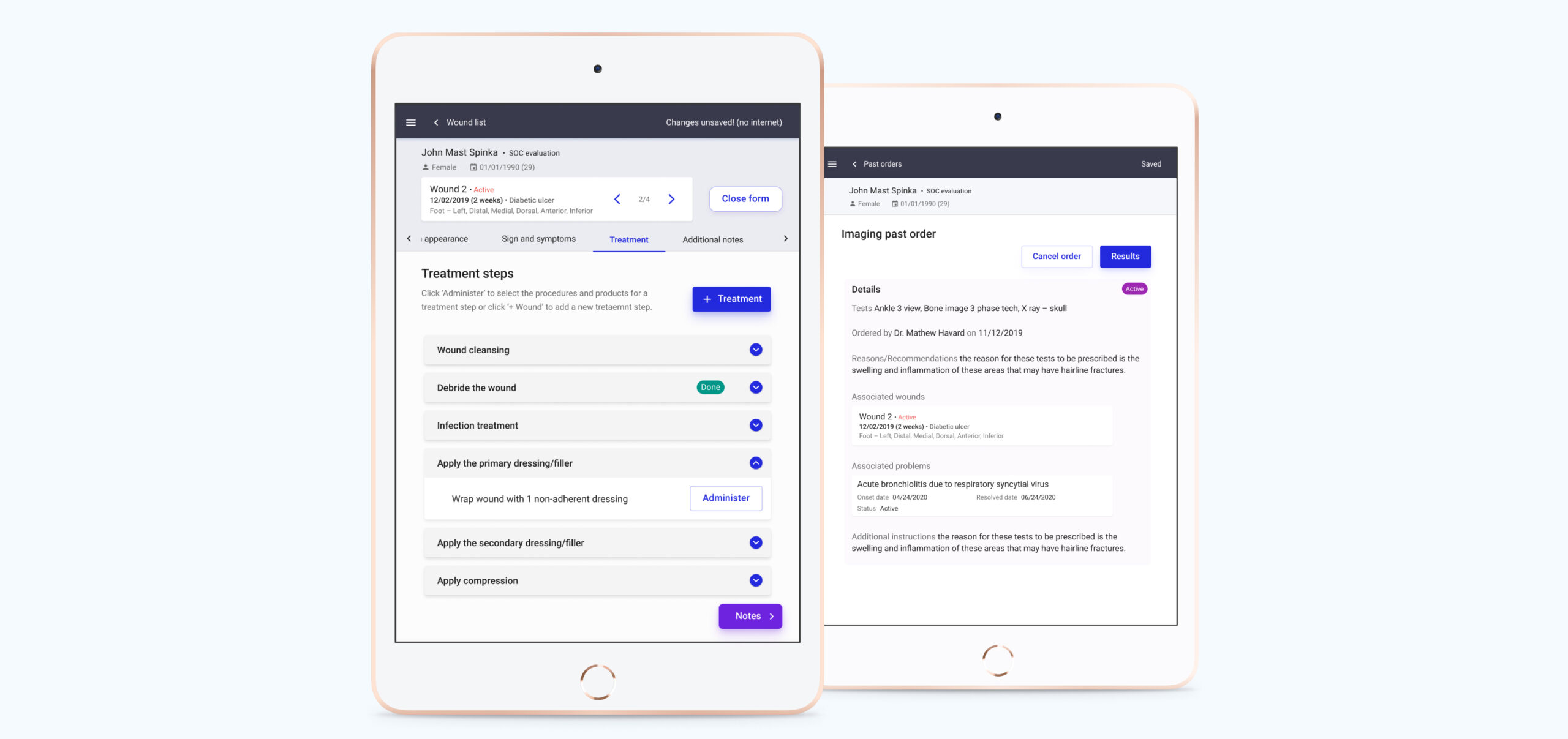
Two screens showing treatment steps (left) and details of past tests (right).
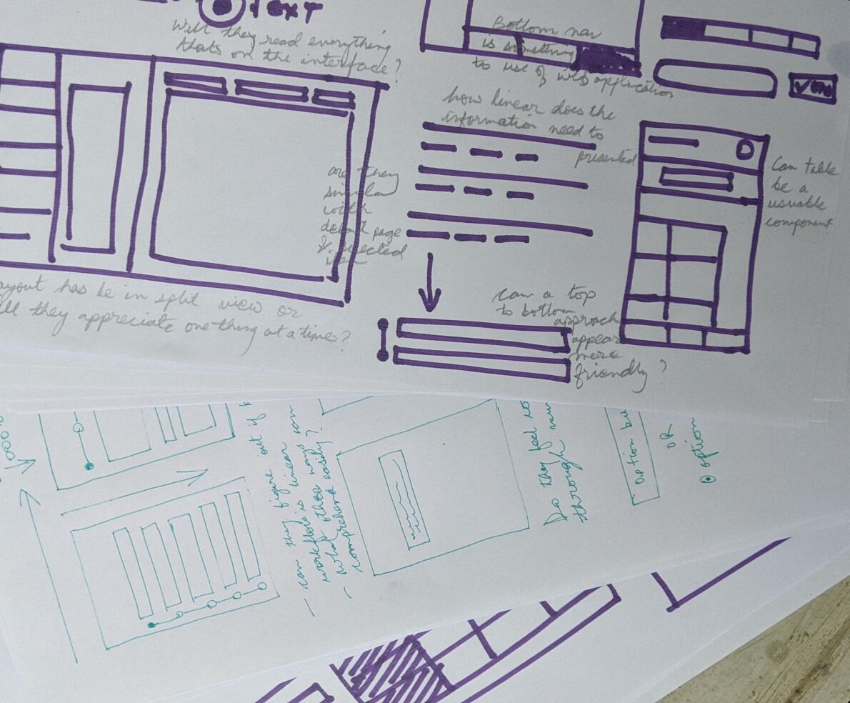
Using a low-fidelity prototype as a subject for discussion, I got answers about Clinicians' behaviours, concerns and pain points.
Learning from field
- They want to save time and cover more patients in a day.
- Elder Clinicians (aged between 45 yrs to 65 yrs) interact with digital interfaces differently.
- Tablet is the most suited device for Clinicians to carry out their job and feels similar to their exisiting paper based documentation method.

An analogy for my learnings was ‘Tunnel vision’ where you just focus on what’s most important and blur out what’s not.
Insights
Match Clinicians' mental model of using paper based documentation to digital interface without any friction.
Most of the Clinicians are aged above 55 years therefore it was important to break-down the interface’s constituents to its bear minimum and highlight only the parts which are needed.
Takeaways from the field visit:
- They are concerned about getting the job done, and correctly.
- They want to save time and cover more patients in a day.
- They are okay with compromises on ‘design’ as long as their job is done.
In order to achieve faster interactions for the user base I was dealing with, it was important to break-down the interface’s constituents to its bear minimum and highlight only the parts which are needed.
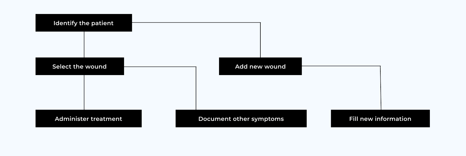
Activity diagram showing the hierarchy of interactions that I had worked upon.
1st design test: The success metric of treatment under 15 mins was NOT met upon testing with 27 clinicians
14 took ~40 mins | 6 took ~30 mins | 3 took ~44 mins | 3 took ~24 mins | 1 took ~14 mins
The changes:
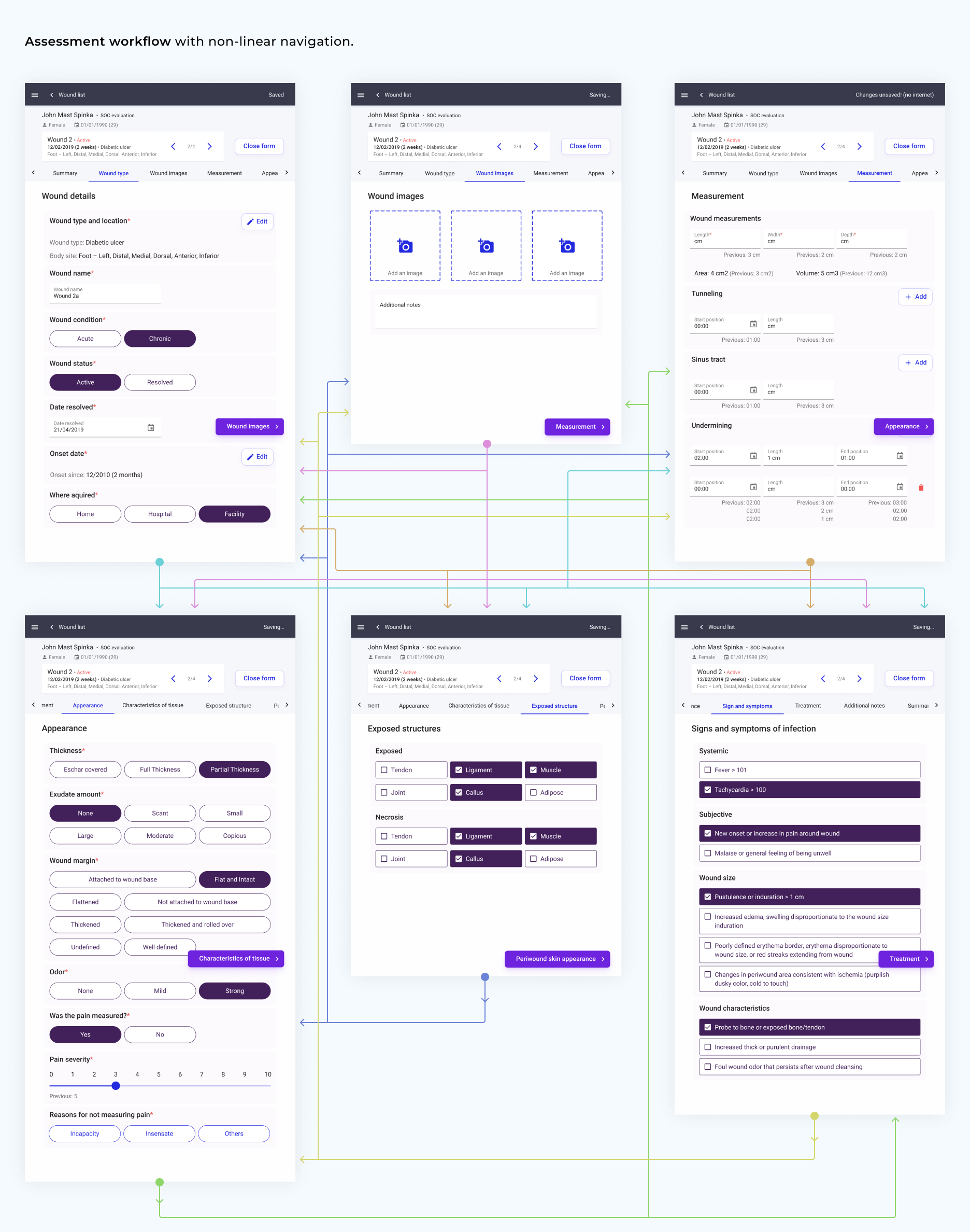
Assessment workflow: Assessement procedures showing non-linear and linear navigation workflows.
Assessment workflow is the most important workflow in the application. The documentation of the wound for a patient happens here and the success of the platform depends on how fast a Clinician can cover the documentation and treatment.
The primary job for me as designer was to present the information that Clinicians might need frictionlessly, hide the information that's not needed and devise a way for faster interactions to capture wound info. As Clinicians are free to go any path to document and treat the wound or follow a linear path to completion, I had to curate a workflow that tailors to both their requirements efficiently.
The different steps of documentation included capturing information such as location of wound, measurement, appearance, exposed structure and so on. Iterating through a series of prototypes, I arrived at a tab based navigation UI on the device so that Clinicians can navigate to any step they wished. Each step also had a FAB with the copy to navigate the steps linearly to the next steps.
A few design decisions
When designing for the elderly, every interaction had the potential to make or break the solution. This shaped the design decisions and the design system.

Scrollable menu enabled Clinicians to navigate to the desired medical procedure page (left) while a floating action button allowed linear medical procedure documentation (right).

Clinicians would read the options and return to the checkbox to select the option (left). I recommended checkboxes with outlines (right) for faster selection.

Similar approach was taken for radio buttons with the outlines. The shape was made rounder without any icon for easier and faster differentiation from a checkbox.
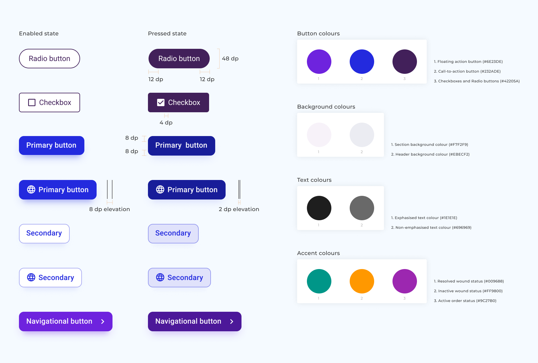
I emphasised on making the controls evident to be noticed and positioning them where Clinicians expect them to be. The size of the CTAs are large and shown with the contextual vocabulary which were expected.
CTAs were designed in the same colour family to make clear association with interactions.
The use of colours on text whether on buttons or on page were given extra care to meet contrast ratios standards for accessibility (WCAG AA) and (WCAG AAA)
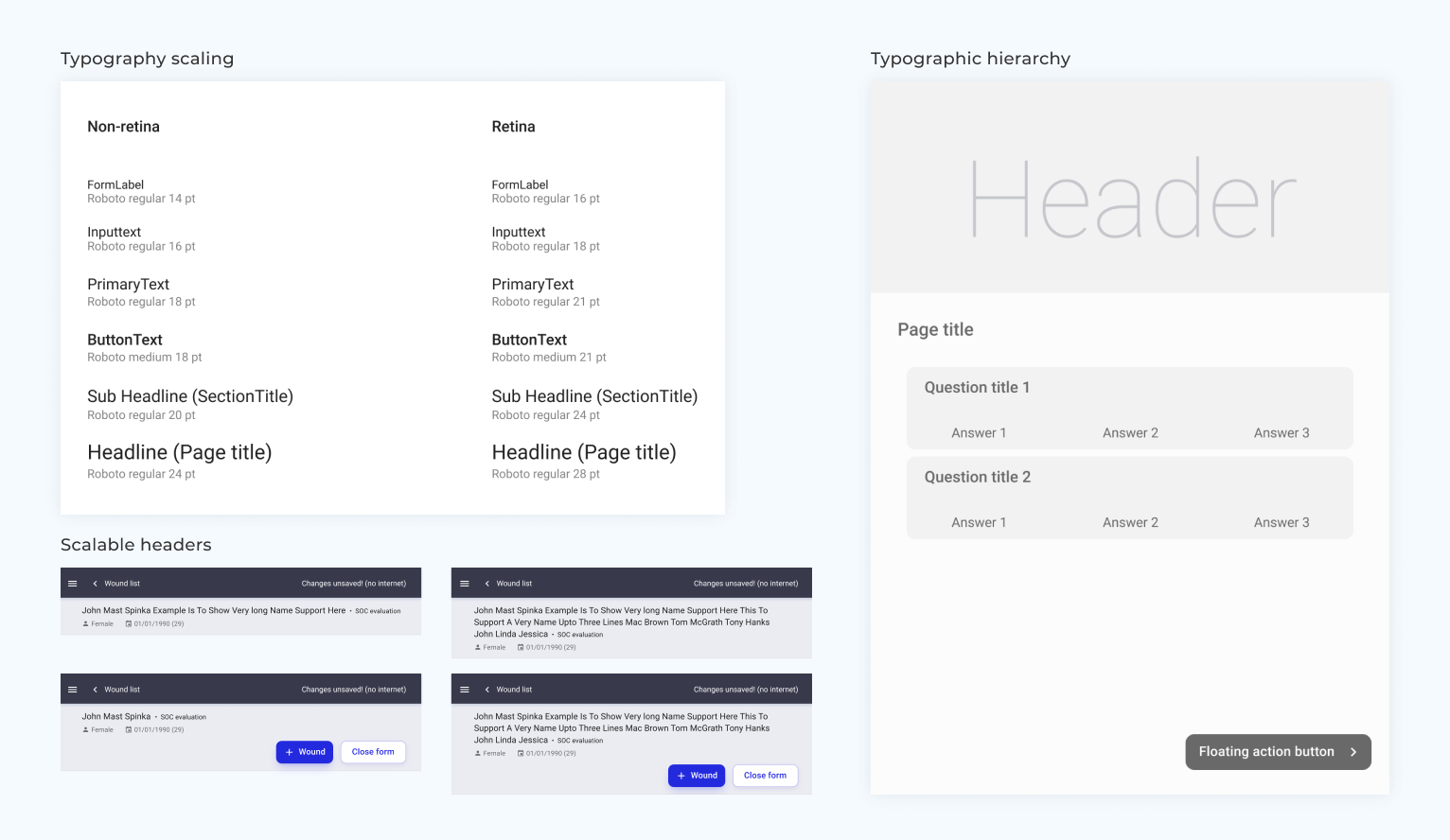
Using text familiar to the Clinicians in succinct sentences. Keeping large font-size heading that could bind the contents below and maintaining space between sections to signify the start and the end. Choosing larger font-sizes for increased legibility for the user demographics.
Using these techniques, I achieved clean and focus enabling user-interfaces.
A few other screens
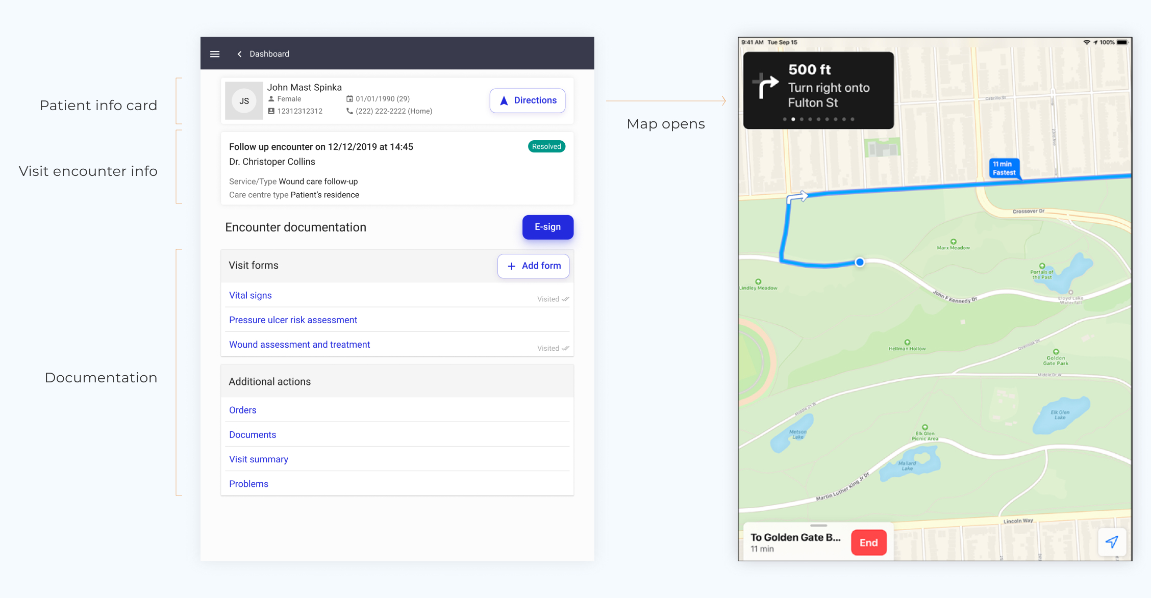
Encounter documentation: Screen capturing the different types of patient encounter and the relevant information related to a particular patient that can be accessed from here.
Encounter documentation page has crucial sets of information like patient’s info, the type of check-up (Start of care or a Follow-up visit) and forms, from where the documentation and treatment for a patient can start.
Clinicians can only provide their services when they reach the right place. I placed a direction button on the patient card that opens up a third-party Map to navigate them to the patient’s address.
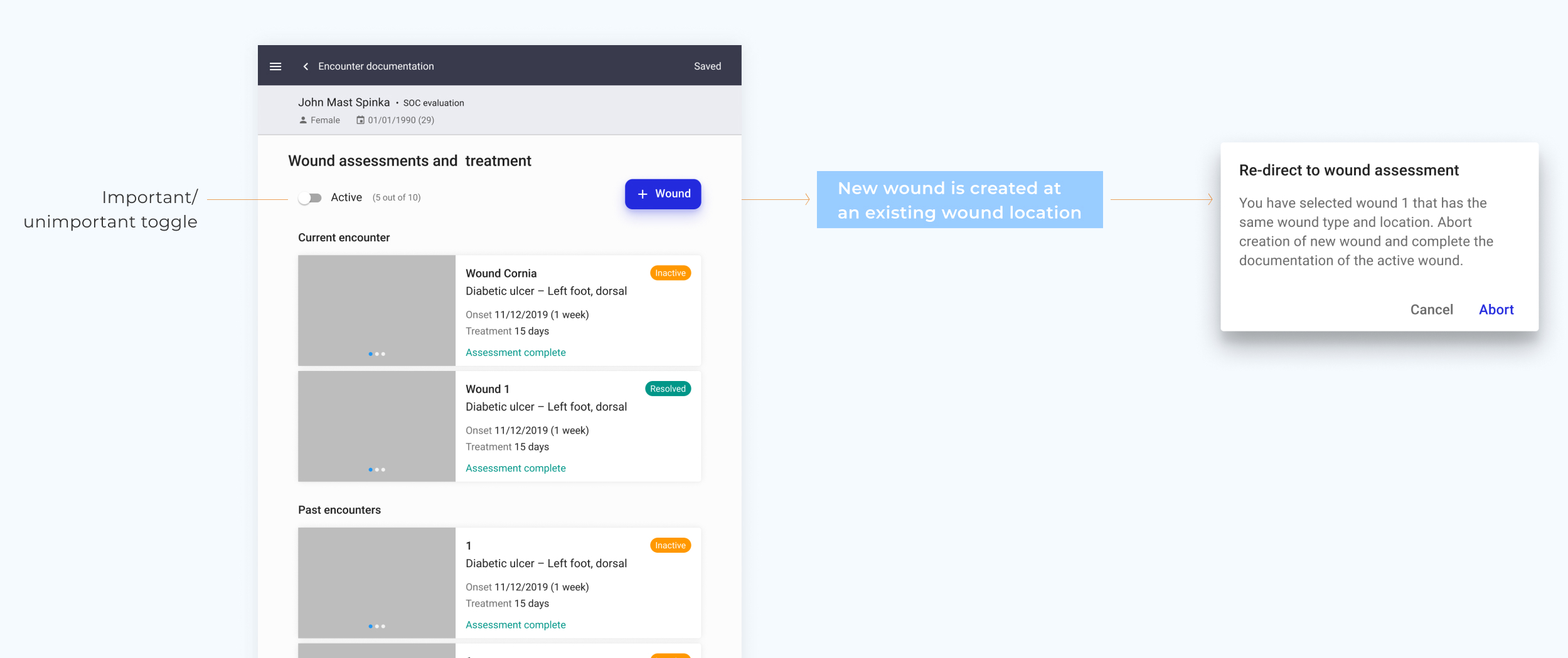
Wound page: Wounds are categorised based on types (resolved, active, inactive) but Clinicians mentally classify wounds as important or unimportant.
Wound page is the starting point for a patient’s wound process. Here Clinicians can either select a previously documented wound that they want to check the progress of, or opt to add a new wound if they detect one. Here Clinicians are concerned with checking ‘active’ wounds while other wound types like ‘resolved’ and ‘inactive’ wound types also exist. To enable Clinicians to focus on ‘active’ wounds, I found that a toggle switch worked better than drop down or tabs as they mentally classify wounds as important or unimportant. ‘Active’ being important and ‘resolved’ and ‘inactive’ being unimportant.
The other challenge while looking at the workflow was preventing wound duplications & identifying the recurrence of 'resolved' or 'inactive' wounds. We resolved it by checking the location of the newly created wound against all the other wounds with the same body location and providing the right prompts to enable Clinicians to make an informed decision.
Final design test: The success metric of treatment under 15 mins was MET upon testing with 22 clinicians
17 took ~14 mins | 3 took ~20 mins | 2 took ~17 mins
We had successfully made a minimum viable product that was ready for the market. Through consistent design evangelism and design delivery, I was able to get both stakeholders and client onboard for having a design-led approach to the project.
You can read more about the design approach on a Medium blog post here.
More Projects
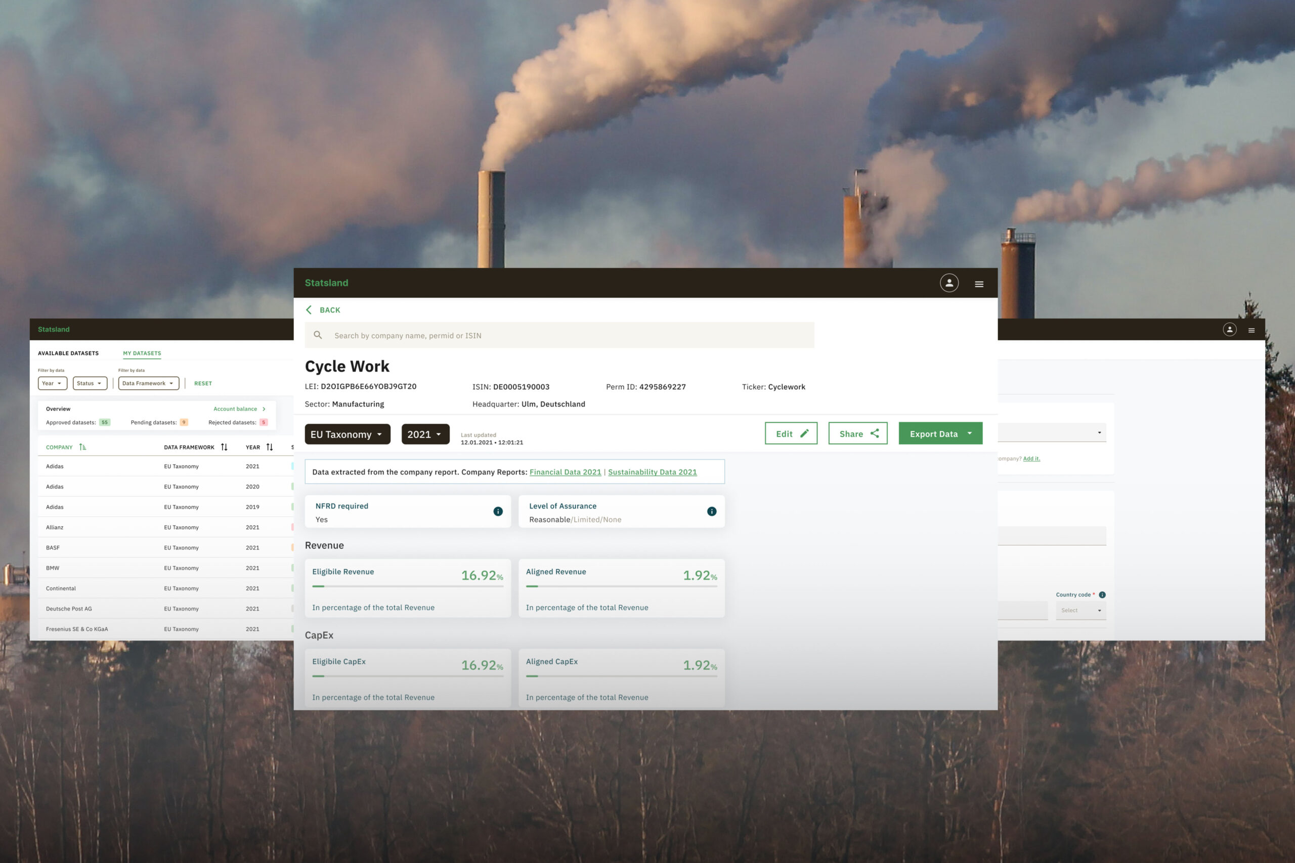
StatslandLaunched an environmental, social, and governance (ESG) data platform from paper to market.
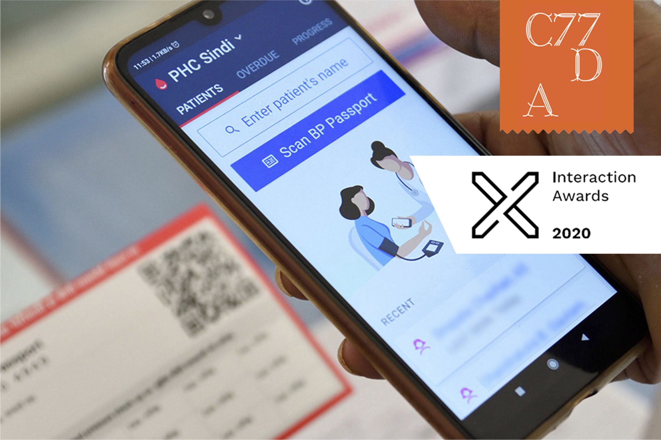
SimpleDesigned onboarding experience of healthcare workers.
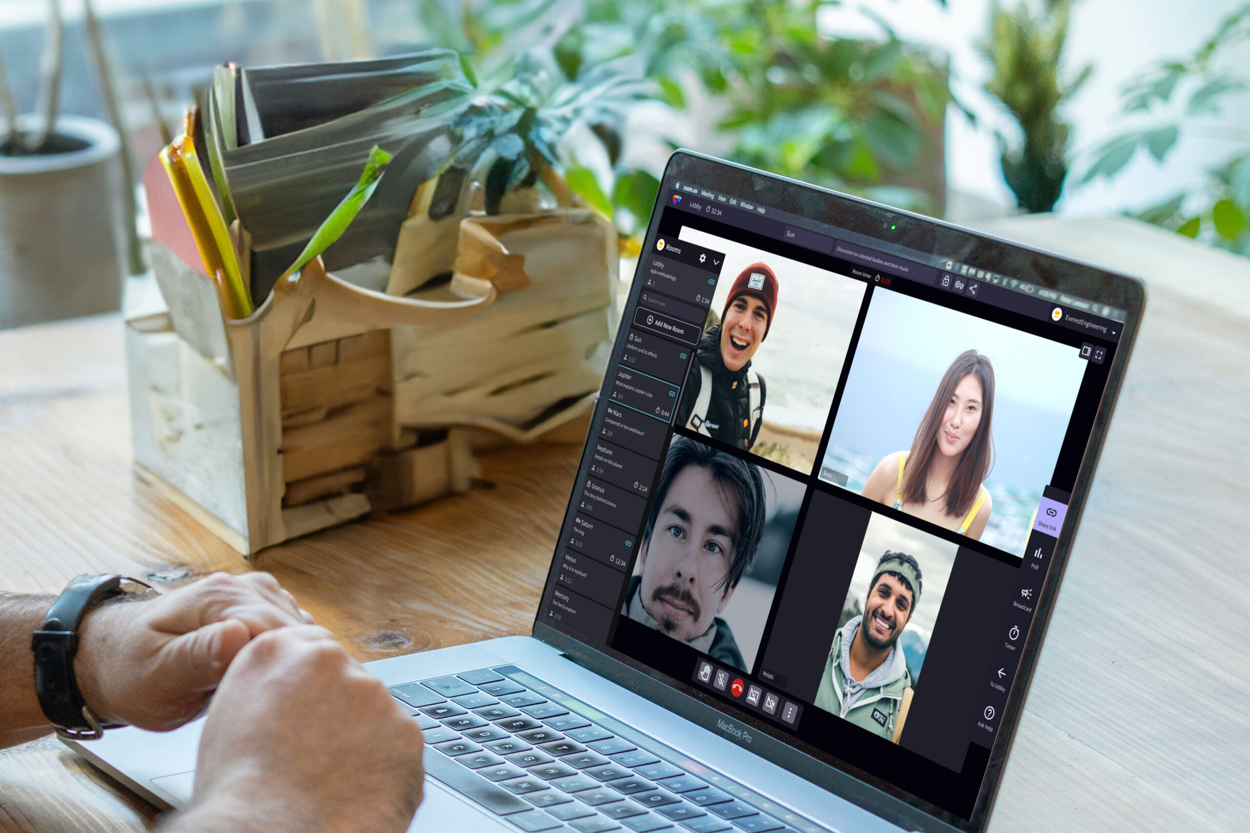
Video FacilitatorRe-designed the platform to support facilitation for large scale conferences.
Connected Health PlatformProvided clarity to stakeholders through prototyping.
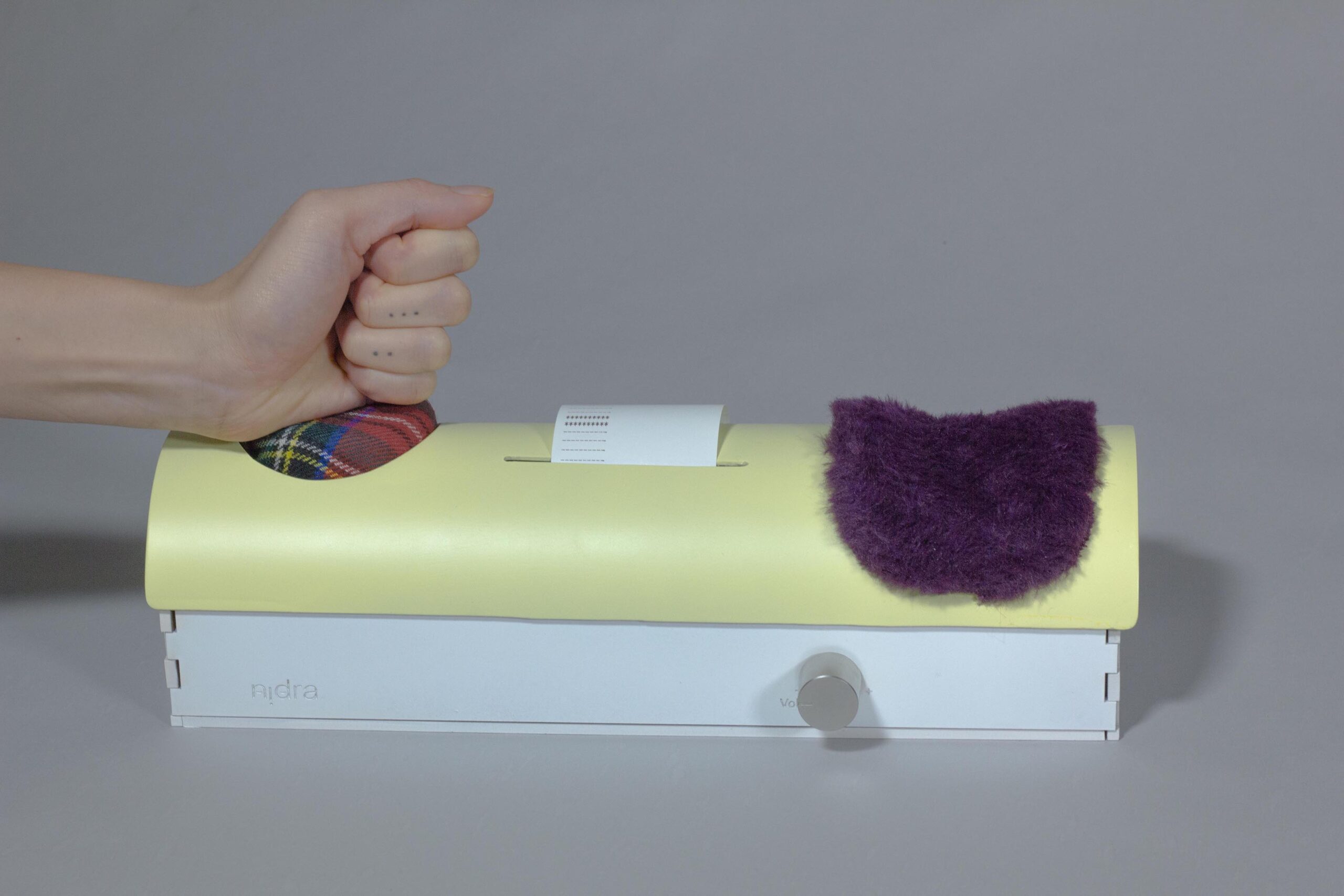
NidraExperimental tool to provide relief to sleep deprived people.

